The Monterey Bay Aquarium in Monterey, California, renowned for housing 81,000 plants and animals across 771 species, has been a staple of the community since 1984. To celebrate its 40th anniversary, the Aquarium enlisted the expertise of Pentagram to revitalize its brand identity. Led by Pentagram Partner Abbott Miller, the rebranding project aimed to honor the Aquarium’s rich legacy while embracing a forward-looking vision.
Julie Packard, the Aquarium’s Executive Director, expressed enthusiasm for the new brand on Pentagram’s website: “This evolution of our branding embodies all the wonder and delight that connects people to the Aquarium and the living ocean. In vibrant ways, it honors our past and aligns with all the possibilities ahead of us.”
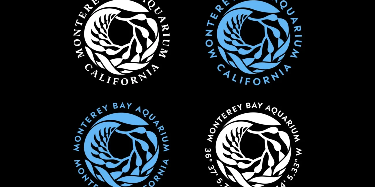
Miller’s team was tasked with creating a cohesive visual identity that unifies the Aquarium’s various touchpoints, including print and digital graphics, environmental graphics, exhibitions, merchandise, advertising, and social media. The new brand identity features a central kelp icon, an earthy color palette, and approachable yet sophisticated typography.
“The kelp symbol was there at the founding of the Aquarium and is a beloved icon of Monterey,” explained Miller. This iconic kelp logo, originally designed by Richard Graef, has been meticulously redrawn to streamline its form and improve scalability. The revamped icon is versatile, serving as frames and filters for images and appearing in halftone or multi-line variations. A repeating pattern, developed in collaboration with illustrator Yehrin Tong, will feature on apparel and merchandise.
The brand’s typography was developed in collaboration with type designers Peter Bil’ak and Nikola Djurek of Typotheque. They adapted the serif typeface Nocturno, giving it shorter descenders and fluid curves that evoke the movement of the ocean. The brand typefaces also include the sans serifs Peak and Peak Rounded by Xavier Erni of Neo Neo / Extraset.
“Our goal was for the type to echo the kelp to achieve a unity between the two elements,” Miller explained. The new color palette extends beyond the traditional ocean blue, incorporating three shades of ocean blue and green, a range of neutrals, plus black and white.
Reflecting on the project, Miller shared a memorable experience: “When I got a ‘behind the scenes’ tour, I was able to feed the giant red octopus, and she stretched out her tentacles, attached her suckers to my forearm, and started to pull me towards her.” This unexpected encounter added a personal touch to an already impactful project.
The Monterey Bay Aquarium’s refreshed brand identity beautifully intertwines its historic elements with innovative design, setting the stage for the next chapter in its illustrious history.


